from december
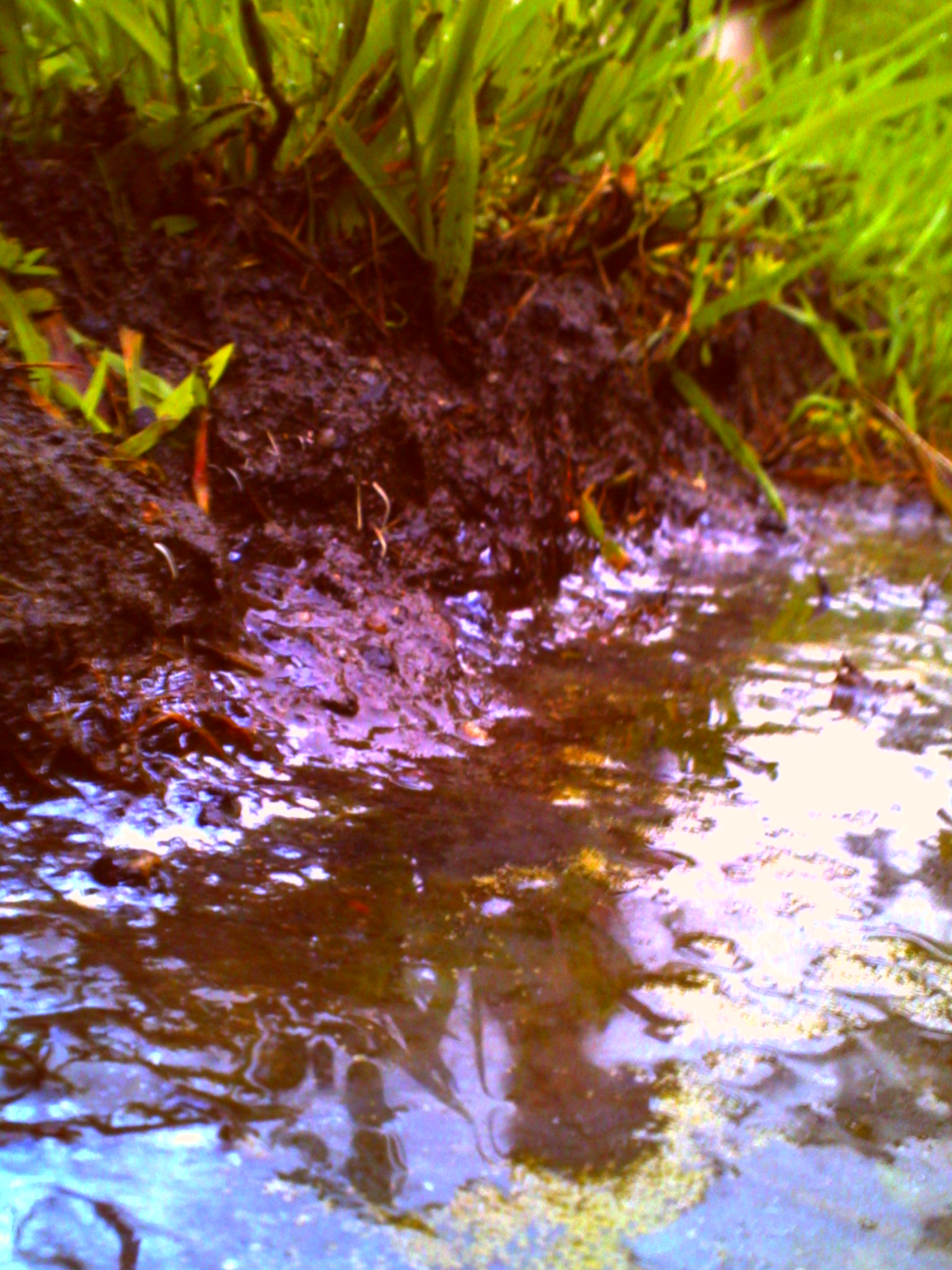
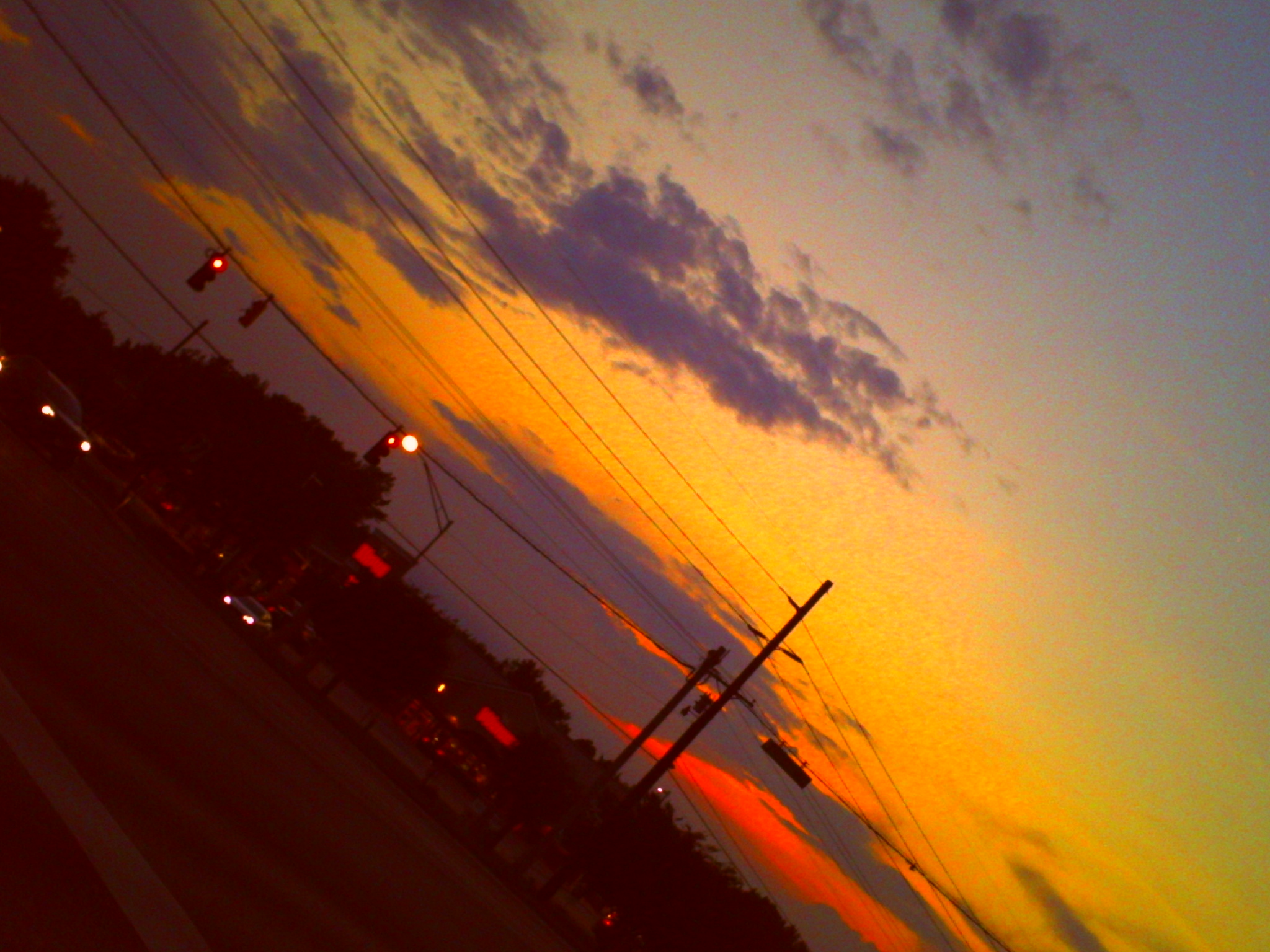
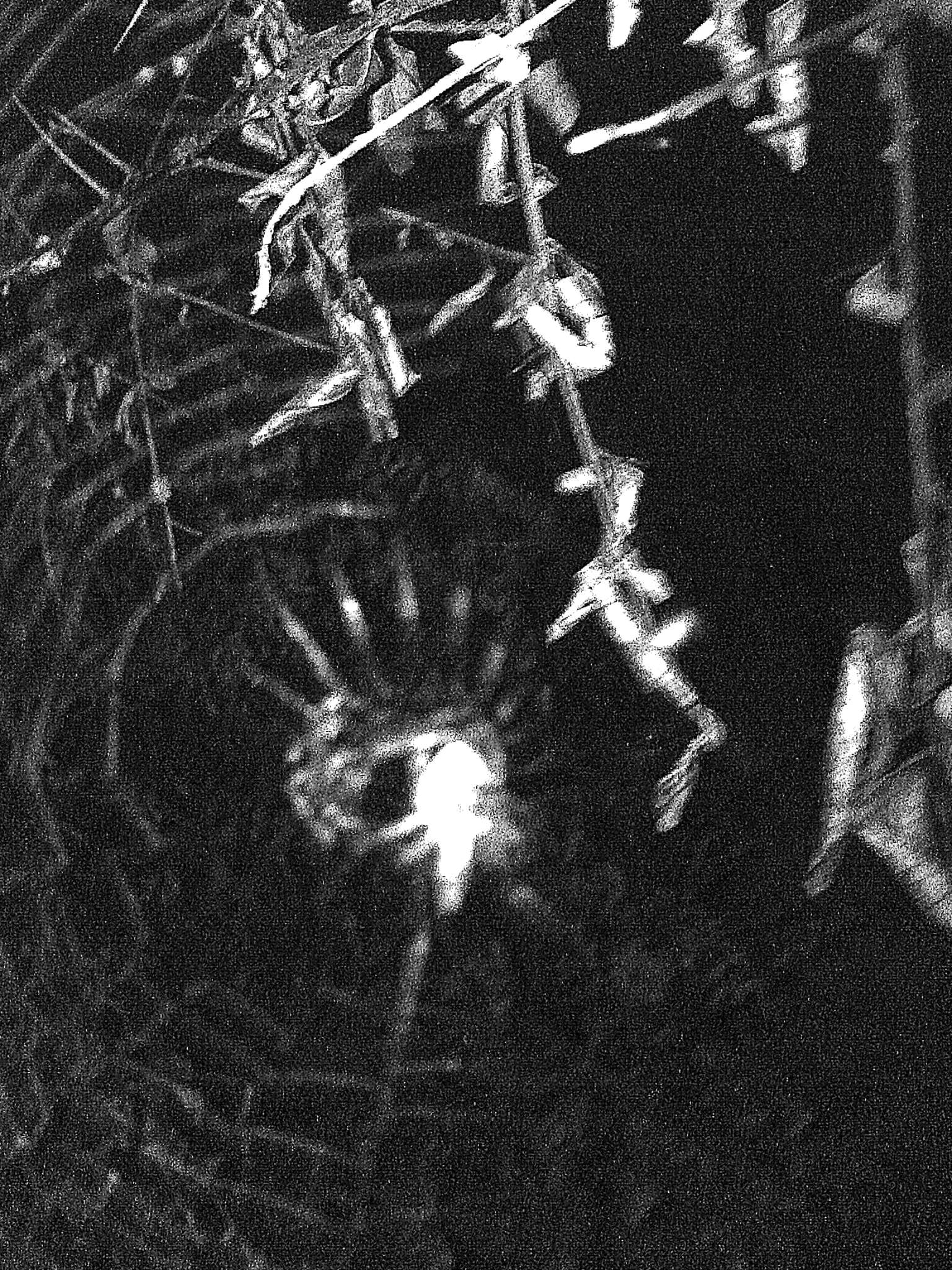
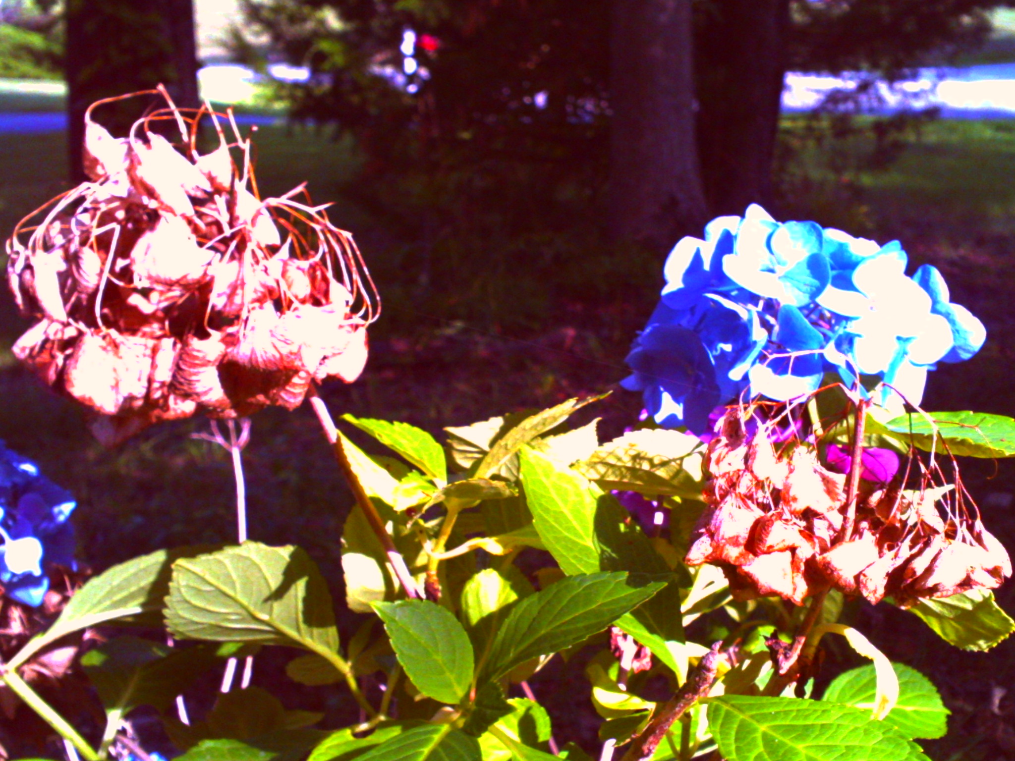
the colors on this shot were really good, but i feel the monochrome carries more emotion
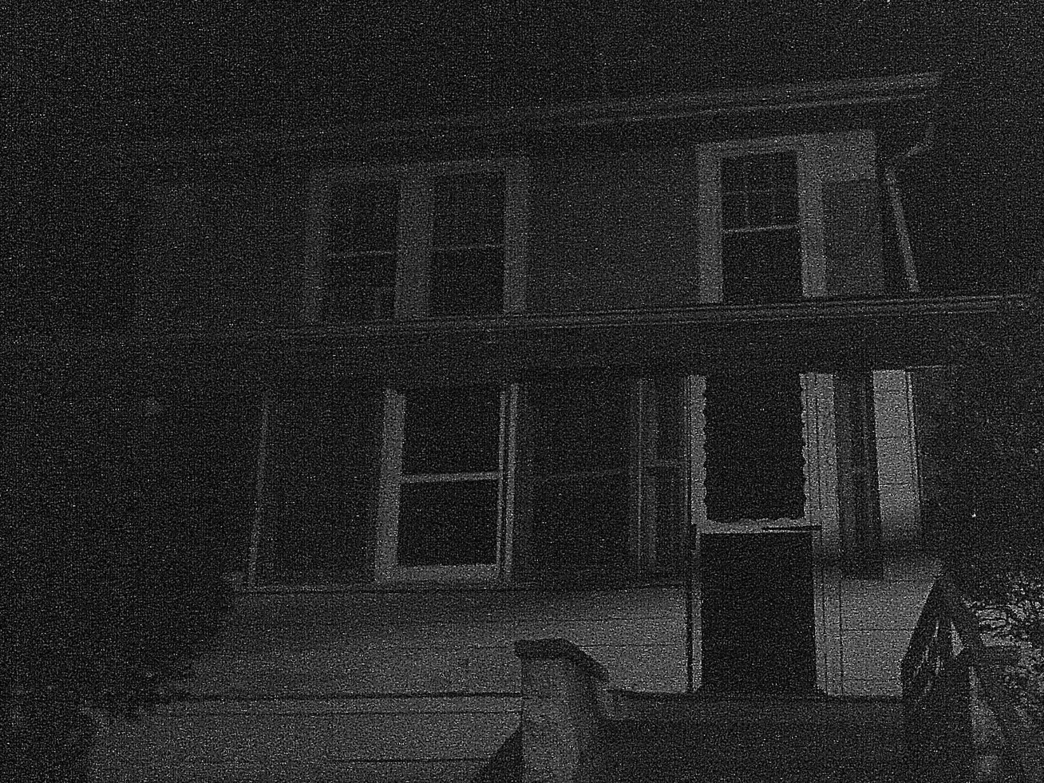
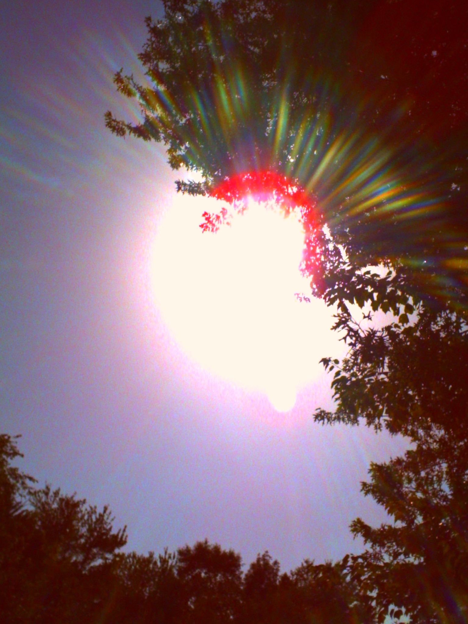
i like the slight off-center angle and the general balance of shapes, but the top and bottom bother me. In the uncropped shot i get the very bottom of the door frame for a few pixels and it produces a distracting jagged line, however cropping it out now the lines of the door lead your eye out of the frame, and the lines running along the top are in a similar situation, they distractingly converge with the edge of the frame. if i was maybe a foot further back when i took this shot the edges would've been much more manageable.

trying out some blend of local contrast edits and agx anddd its overcooking the images a bit, but i think maybe i can work with it. i think if i can tame it agx could be a quicker way to slap some S curving on my images before doing local contrast detail work instead of using rawtherapee for curving
oh and yeah, there are shooting ranges in malls in america. because apparently everyone here fantasizes about firing off guns in the mall and needs an outlet to do so.. safely. i guess. (first one is a lightgun sorta deal and the second one is an airsoft range so, no gunpowder, but still uh. still a bit weird.)
it hurts
i know how horrible it feels to want to be seen so i carry a camera and shoot this feeling out of others? and masturbate with it too?
also what the fucccck i forgot i had found my favorite hat in march after having lost it for months... then it disappeared shortly after once the housing panic started. god damn........
also also fuck i used to dress a lot more fun. and go out more. ugh. it's too hot and non air conditioned in here for me to think anything like that though. i'm barely more than a corpse right now. it's all so heavy. so so sos os so so os so heavy. there's still so much to do. fuck.
birdflight ending
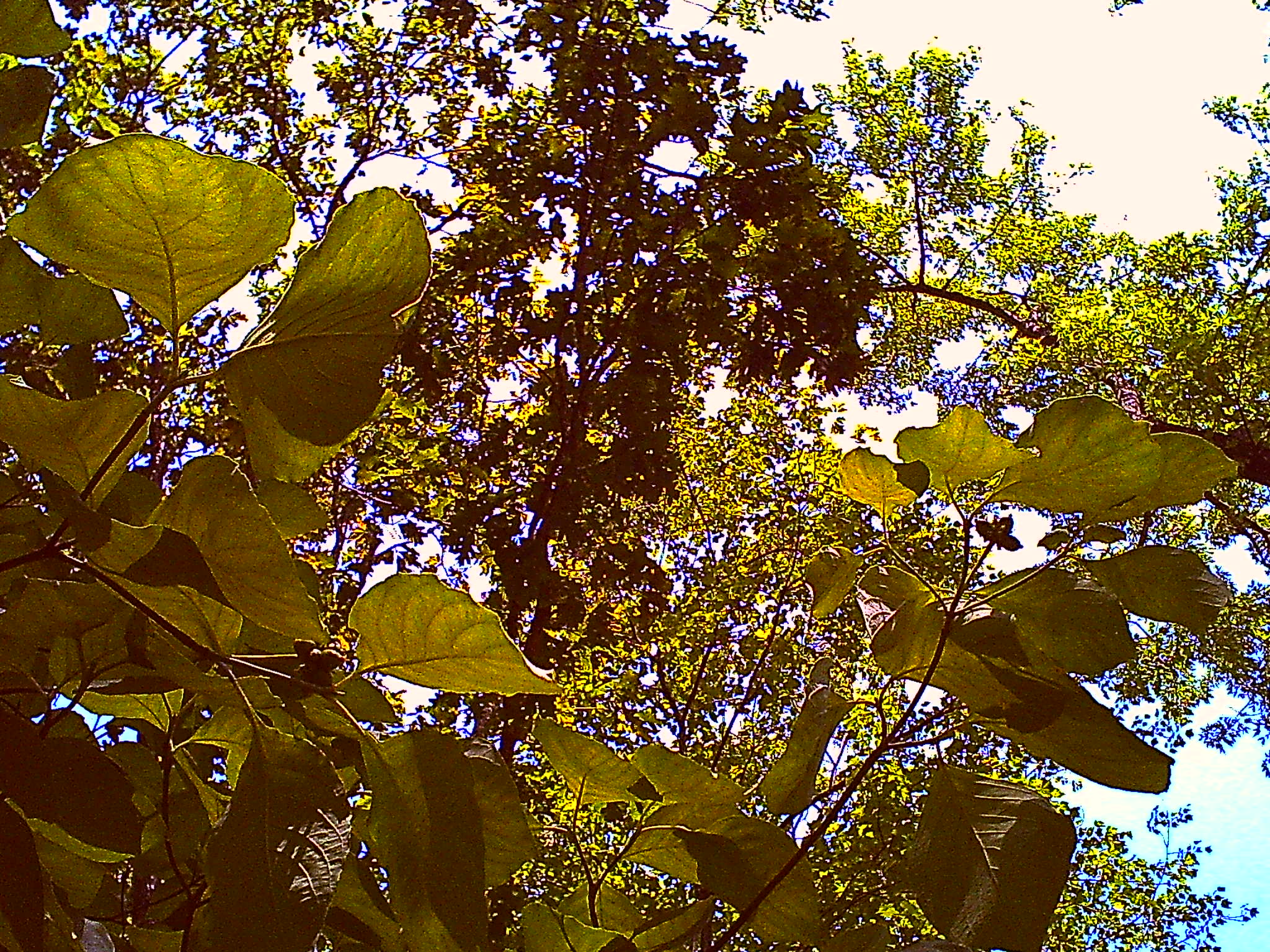
shapness shapeneeness pshshshah shapes
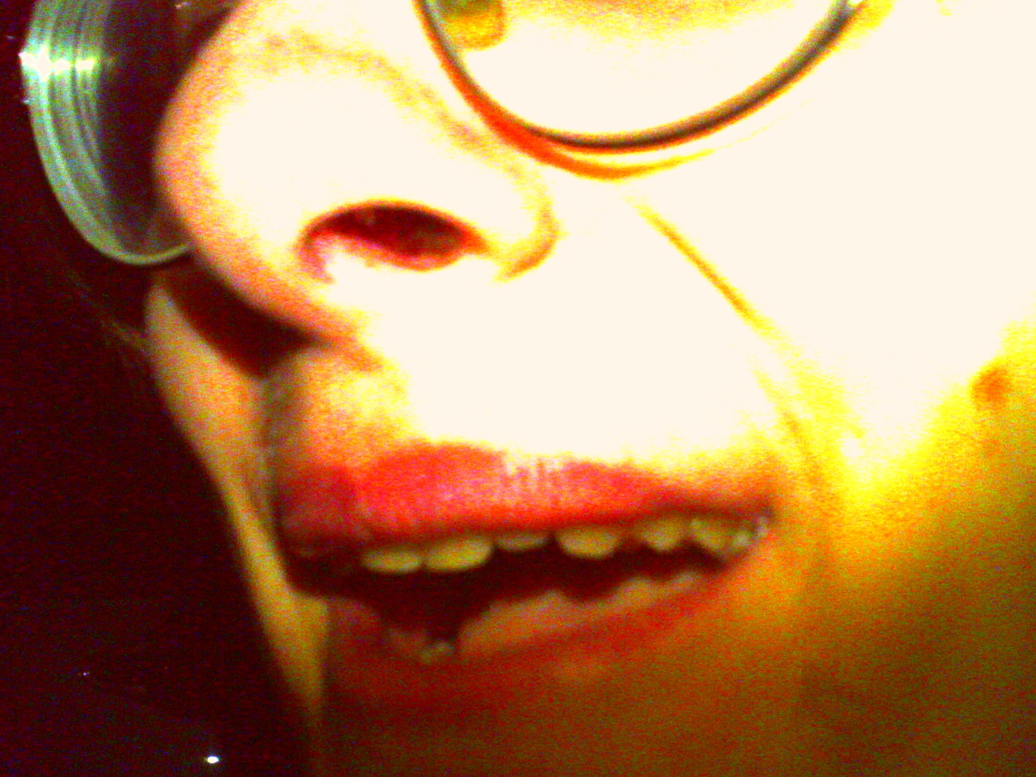
;)
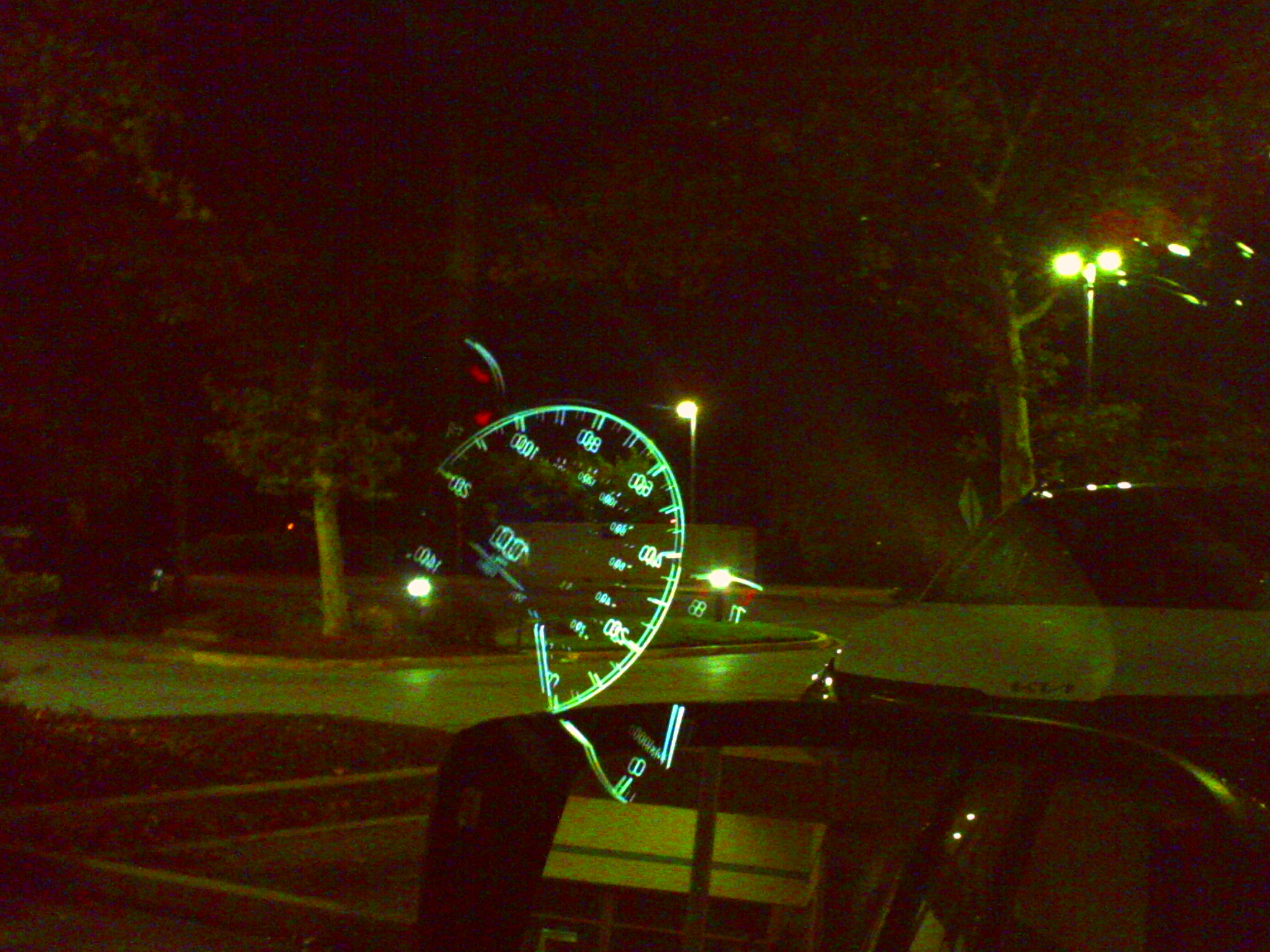
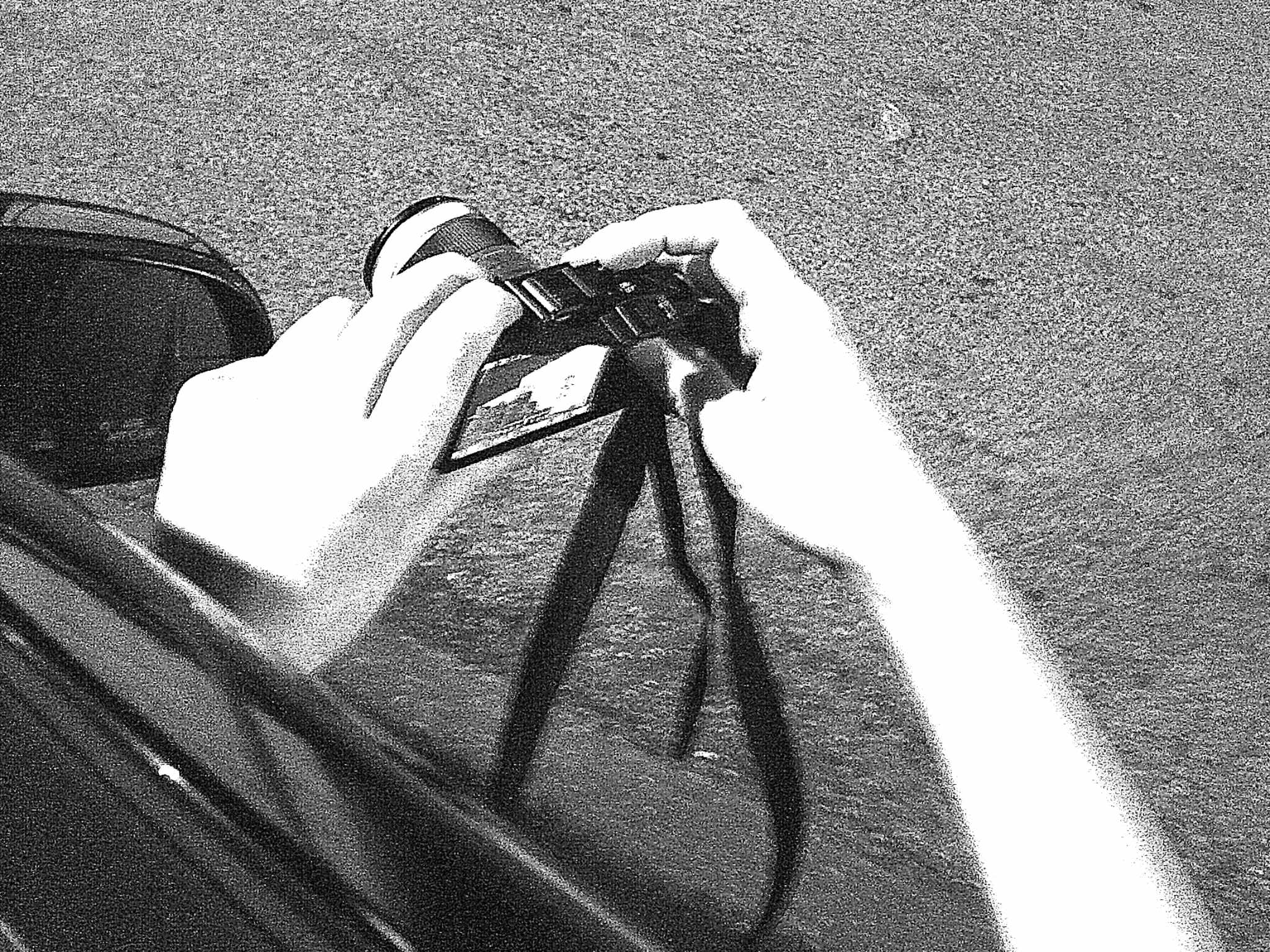
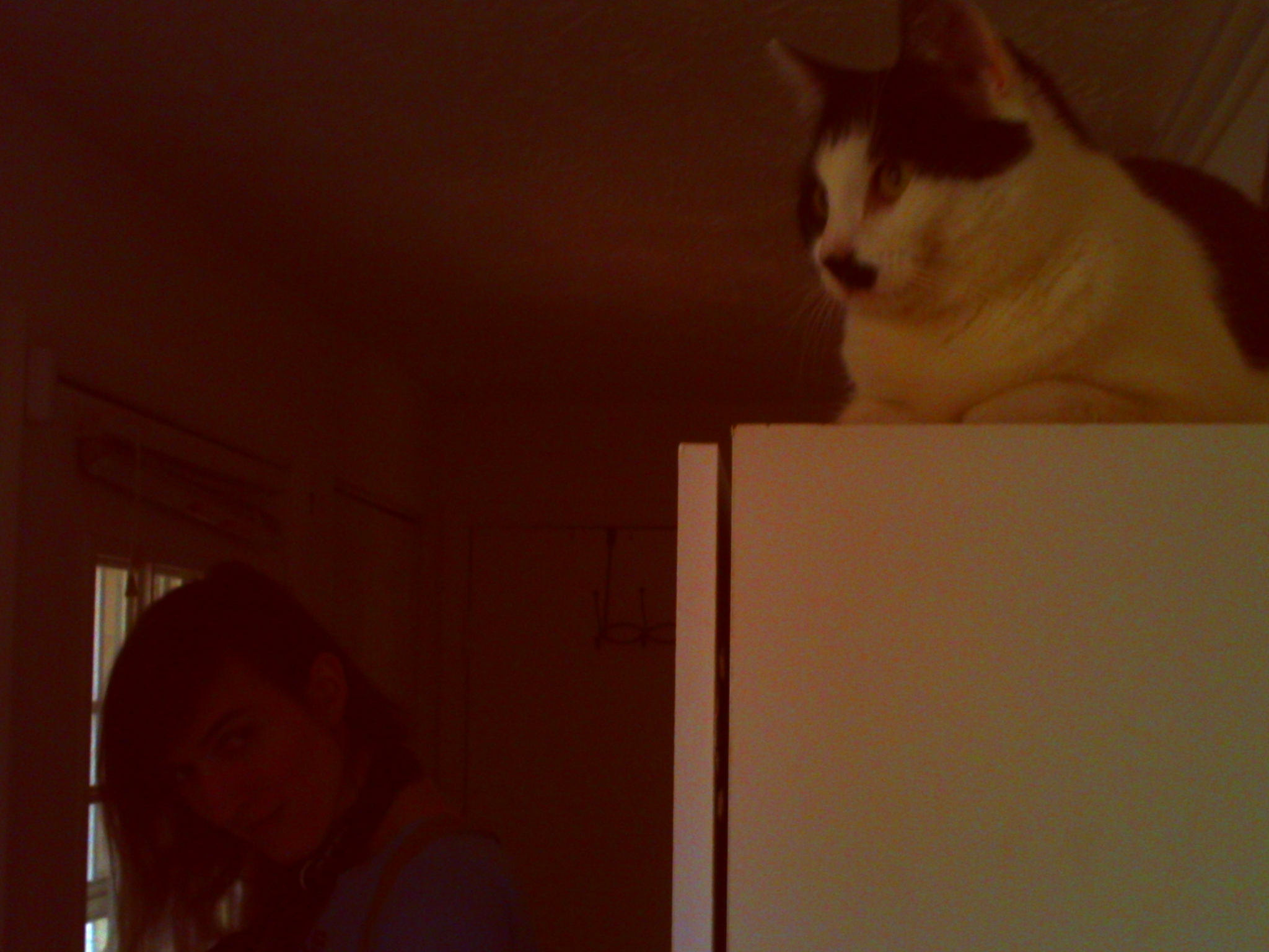
fun camera
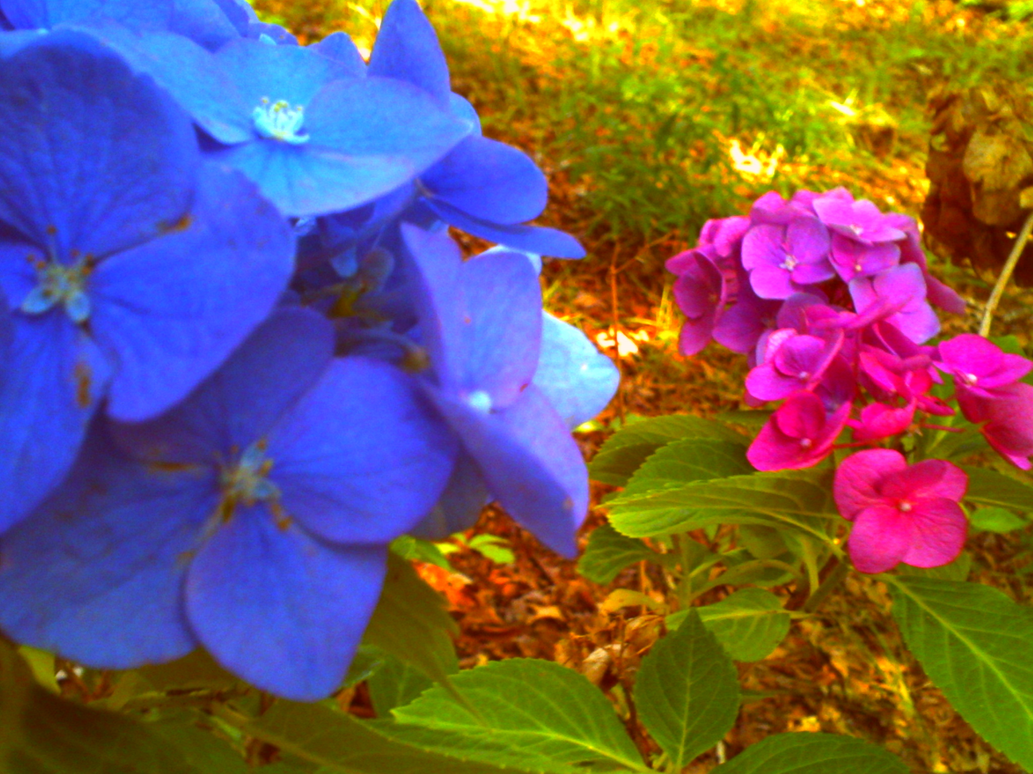
i felt the individual balloon photo was too busy so why not make it worse
view of it in darktable before export second
playin around with darktables filmic rgb again. its soooo finicky its almost an intuitive way to do S curving but then on some photos its just kinda a nightmare of tweaking numbers hoping for something good.


Post a comment