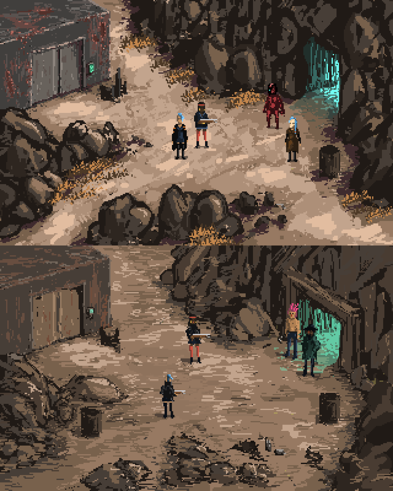
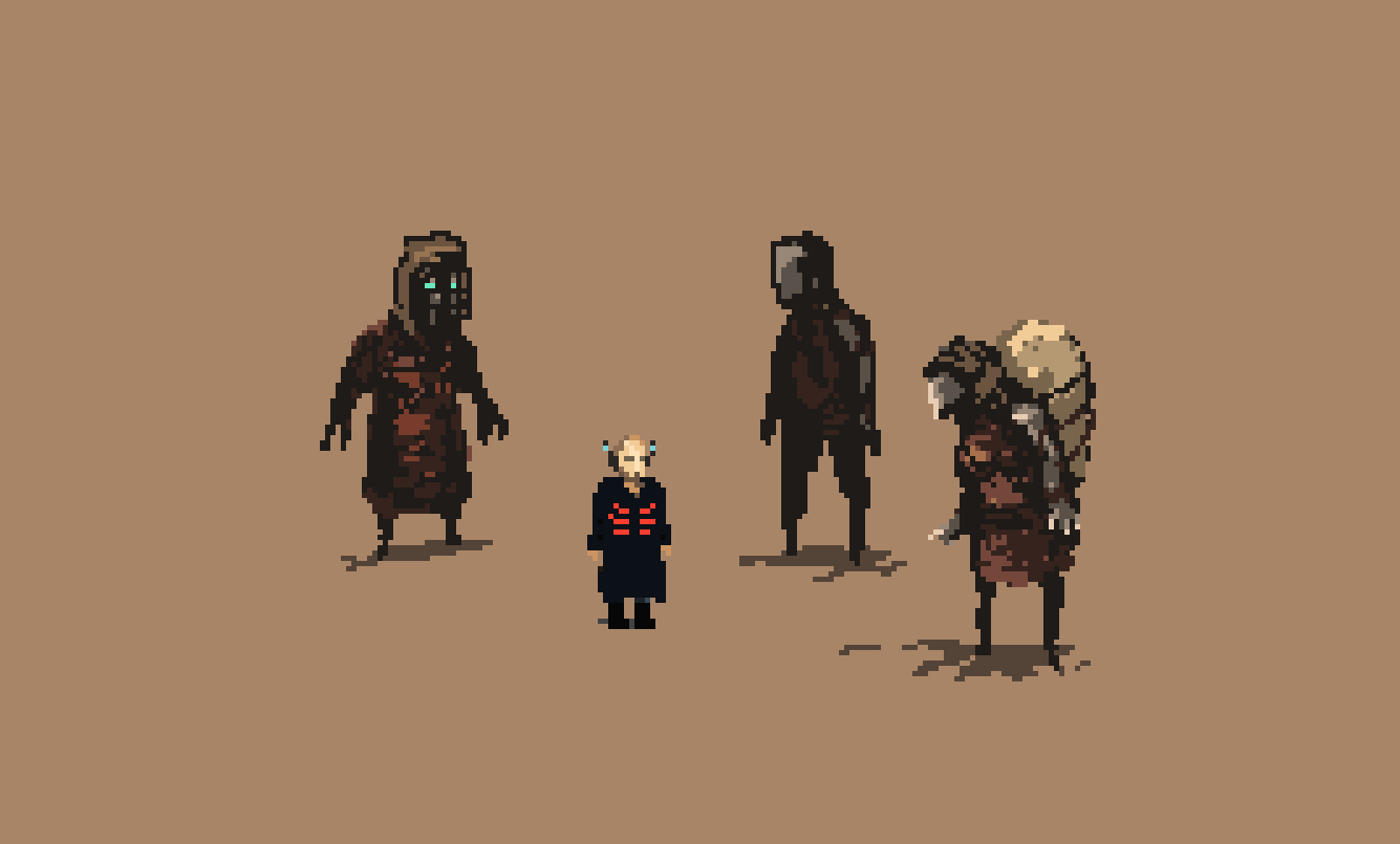
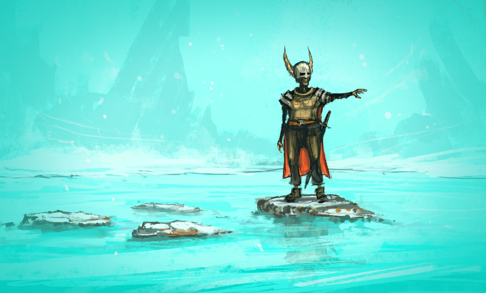
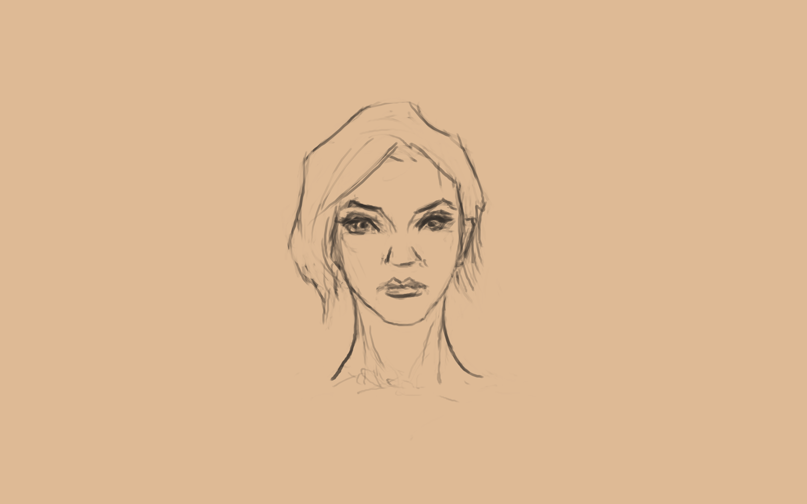
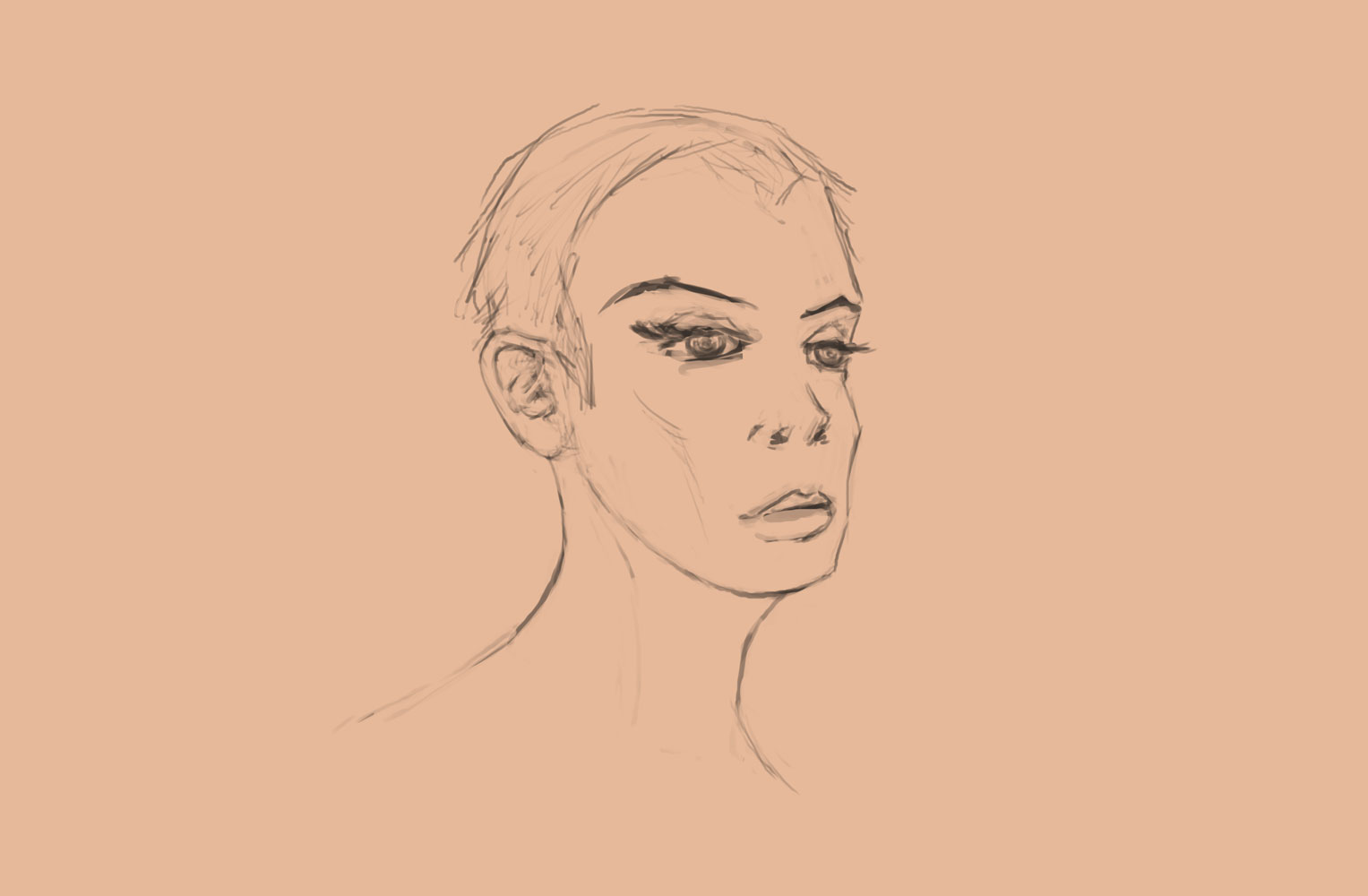
Redoing on old scene to see how much the art style changed in one year. (Just curiosity.)
Sidenote: Pausing my Daily Art at the moment. Too much work, not enough discipline. And somehow, after three years, I felt like I needed a pause. Have some days in my life where I didn't have to think about that one image I still have to do.
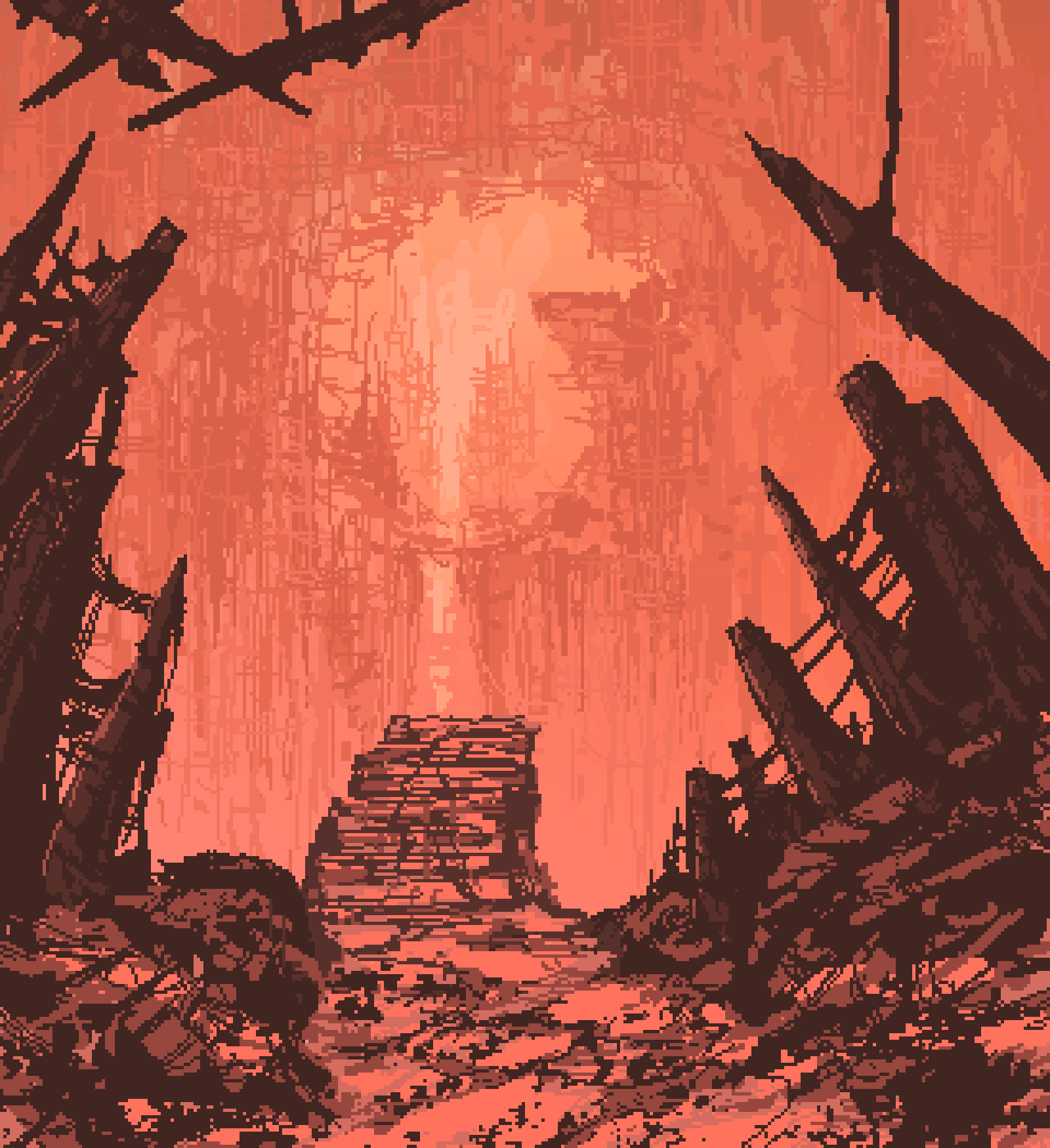
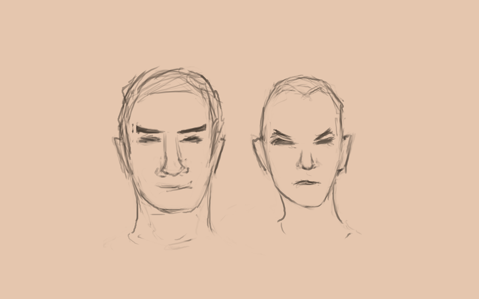
I don't know where this is going. Maybe nowhere.
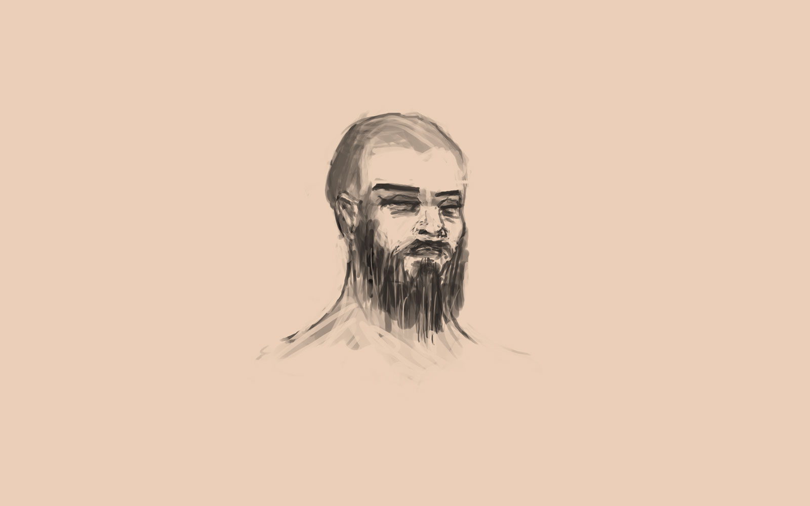
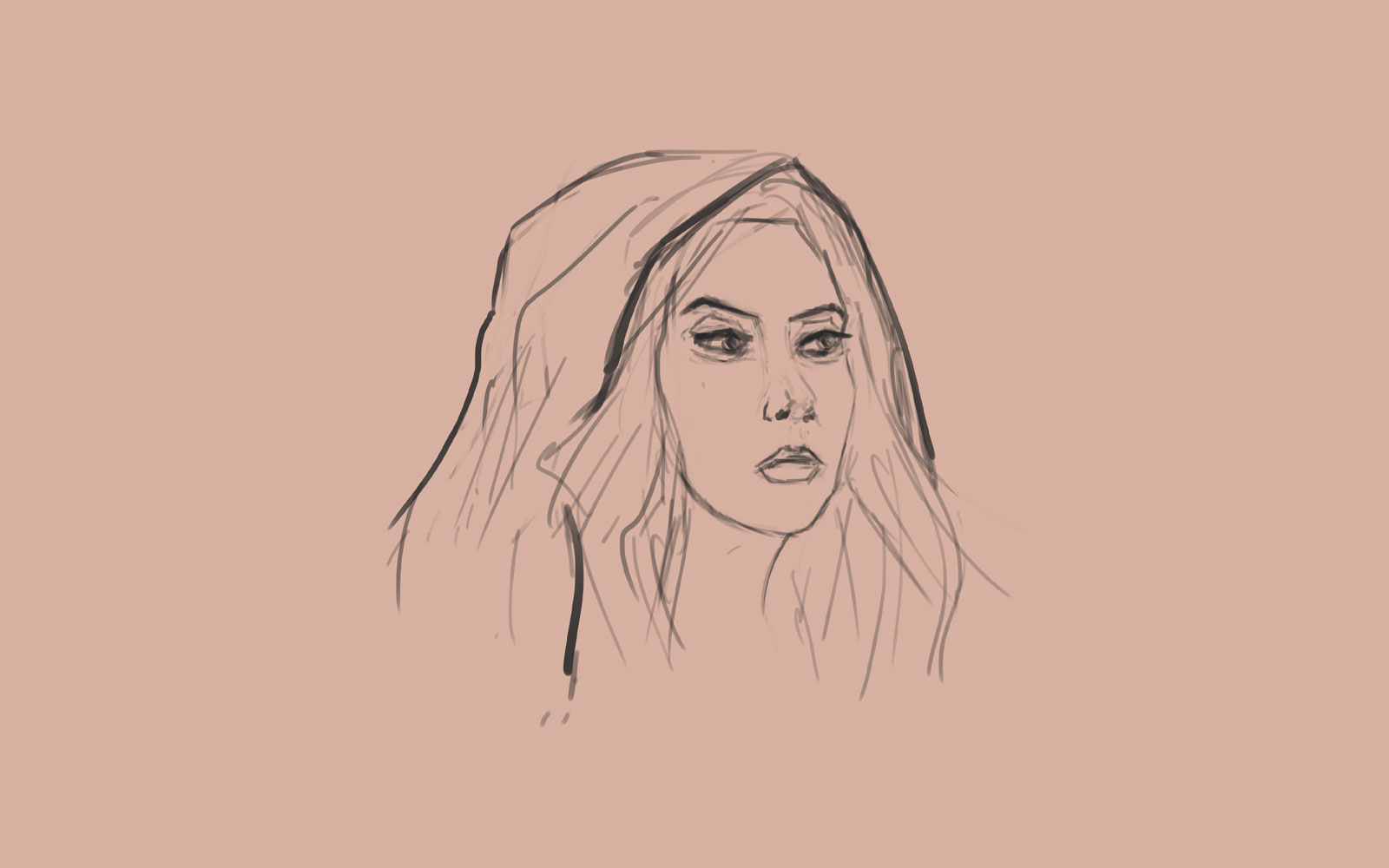
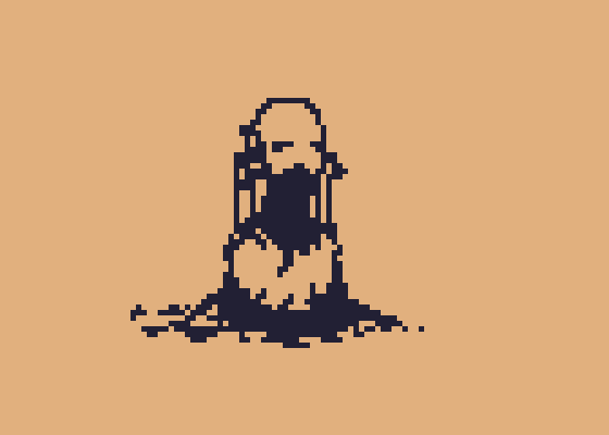
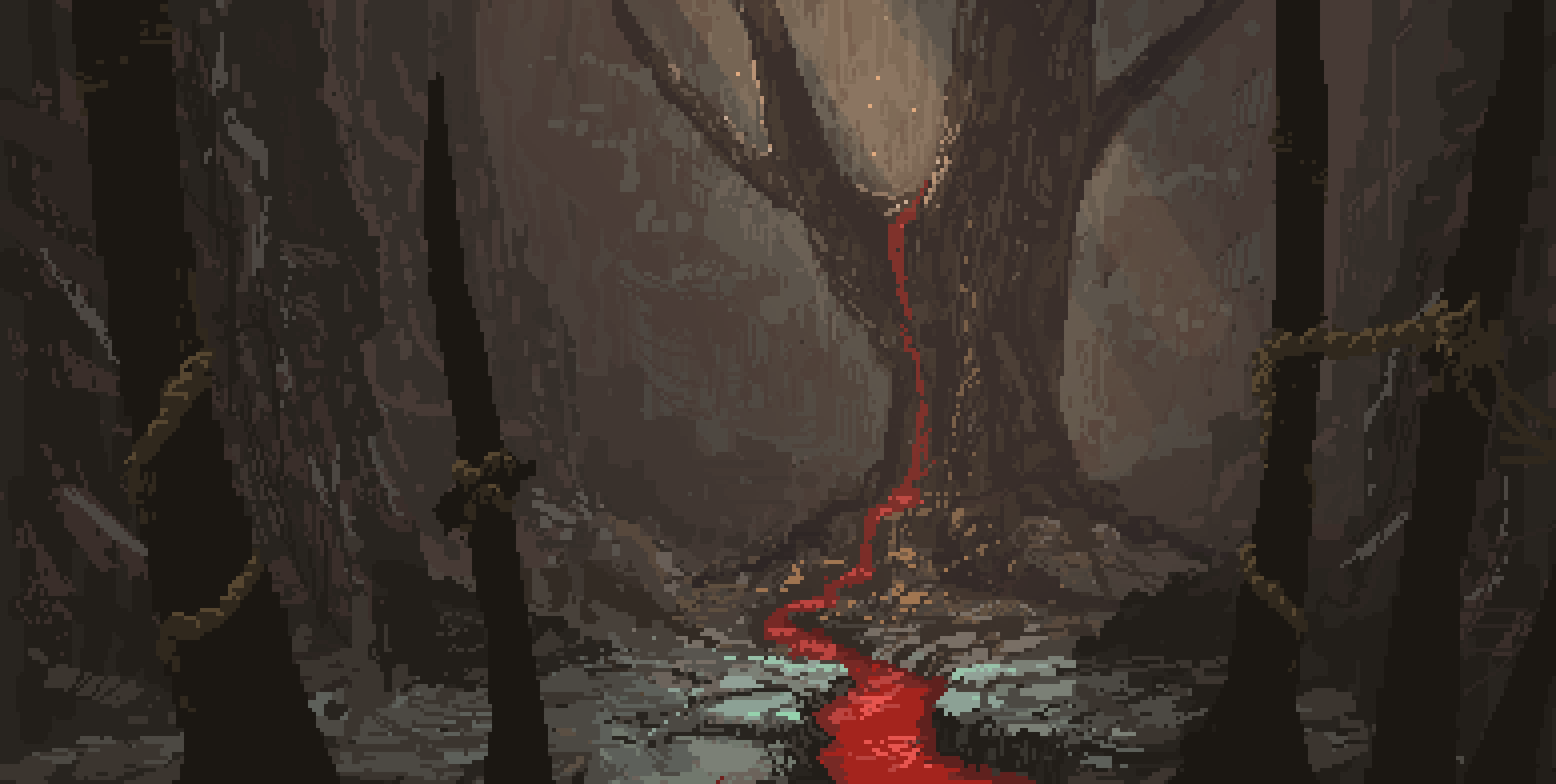
Random stones.
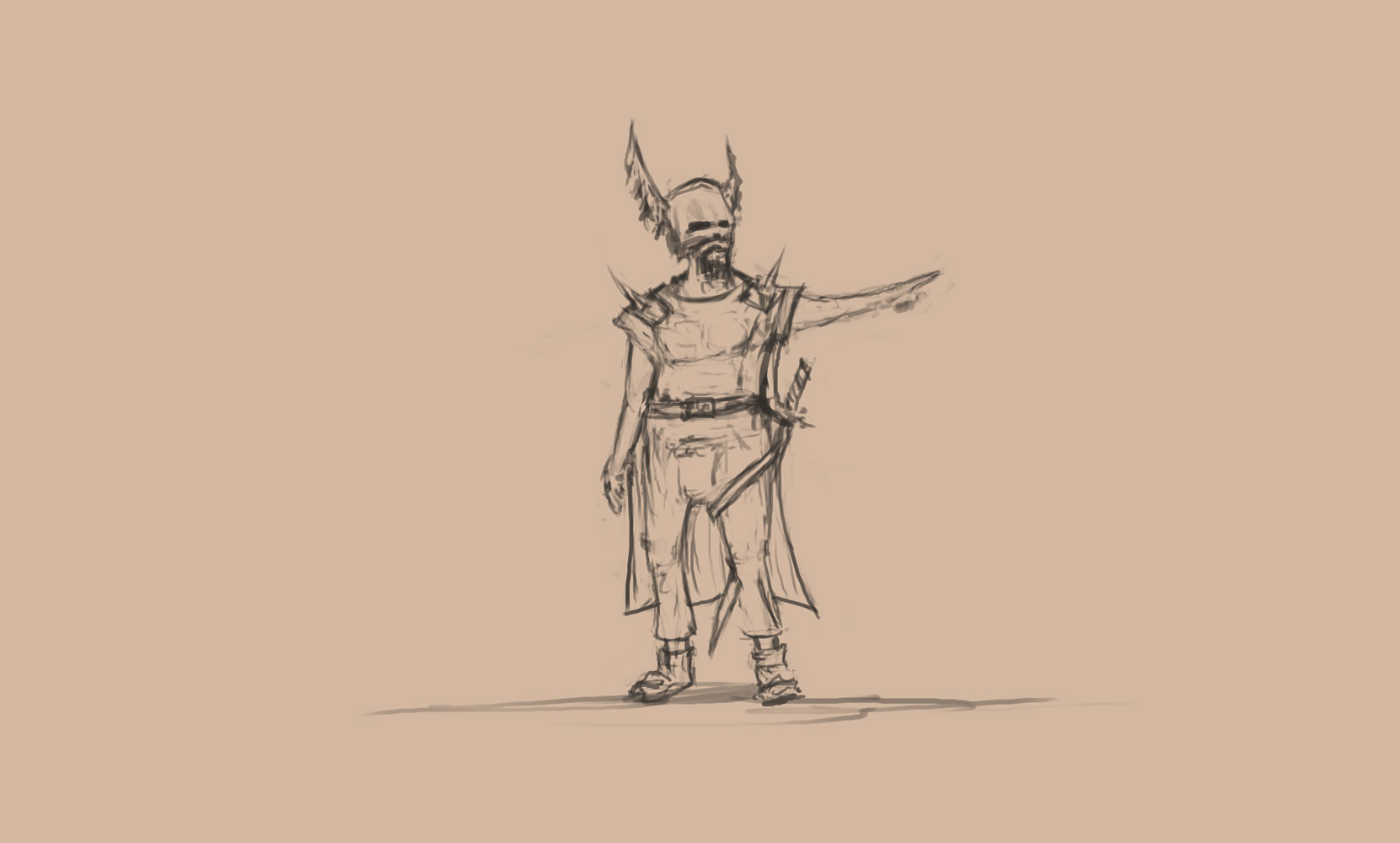
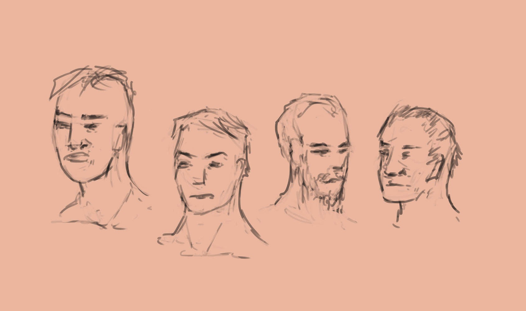
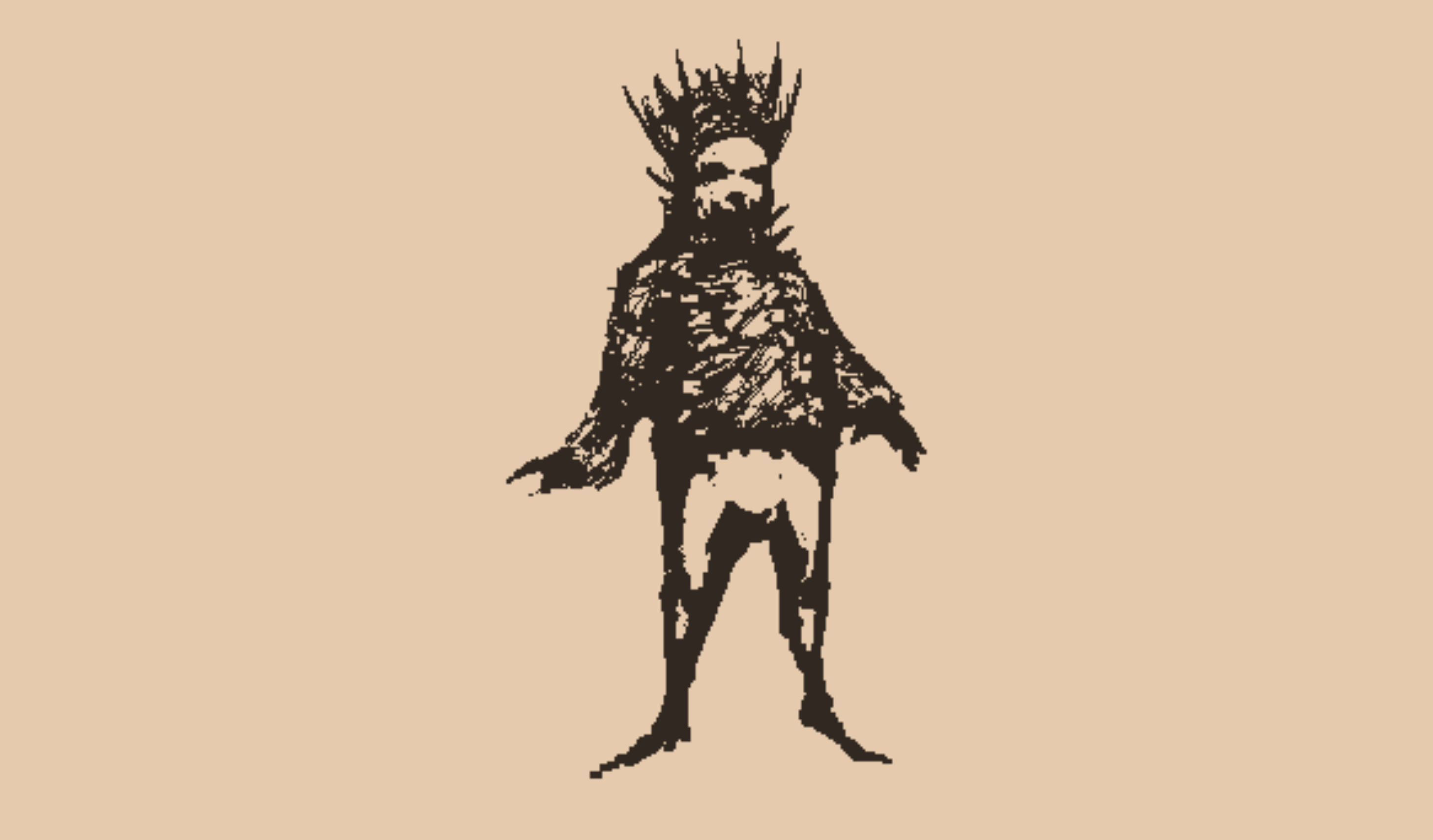
WIP
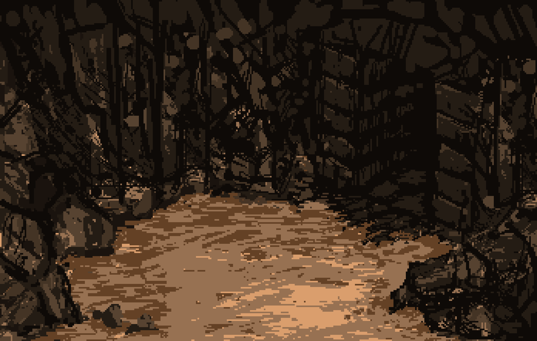
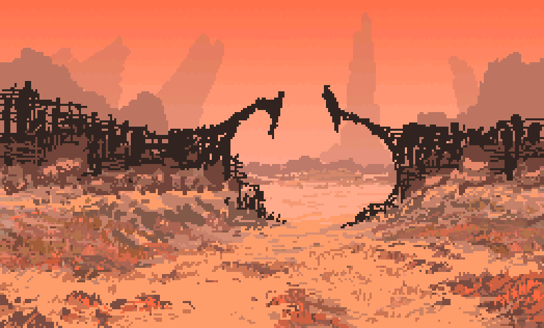
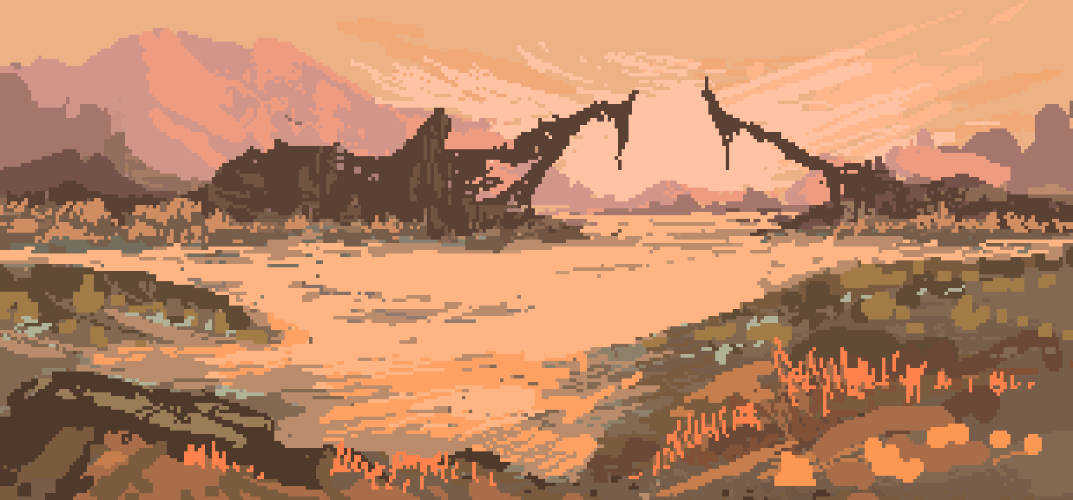
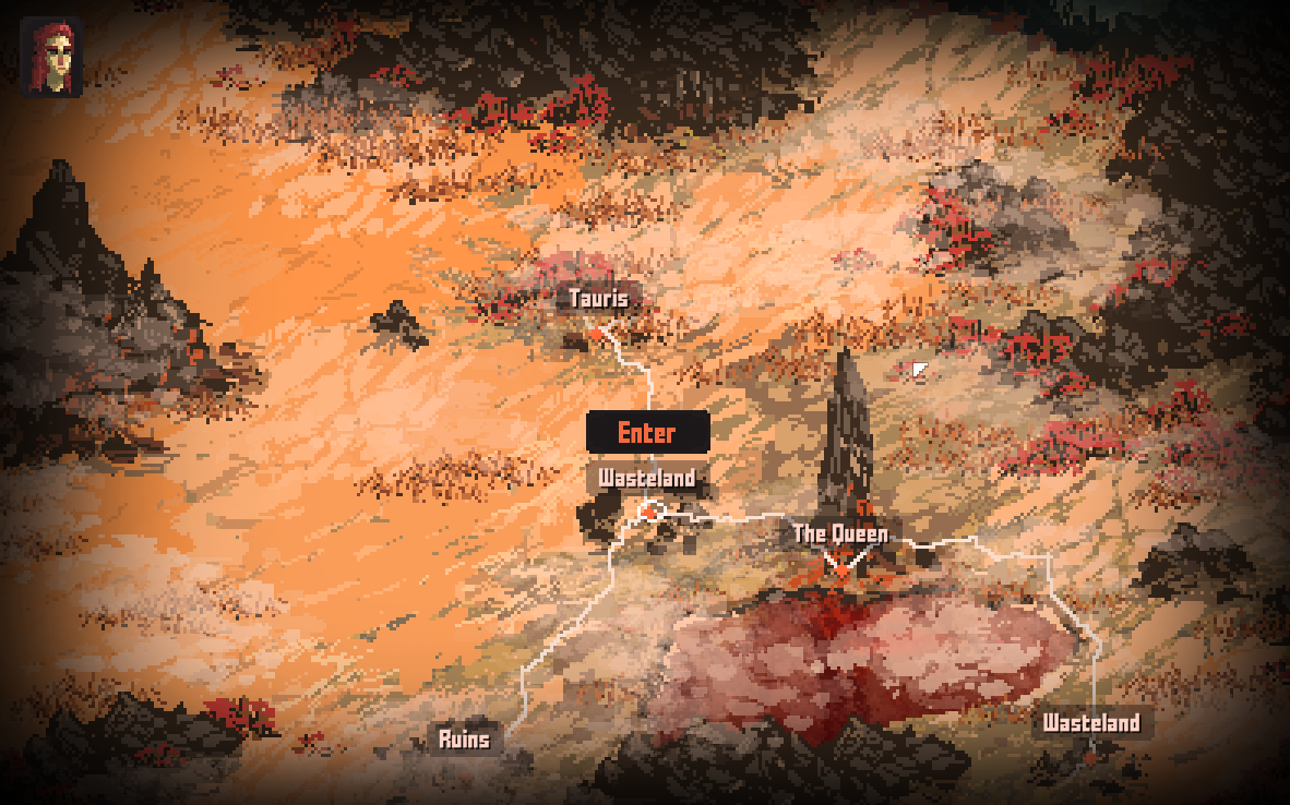
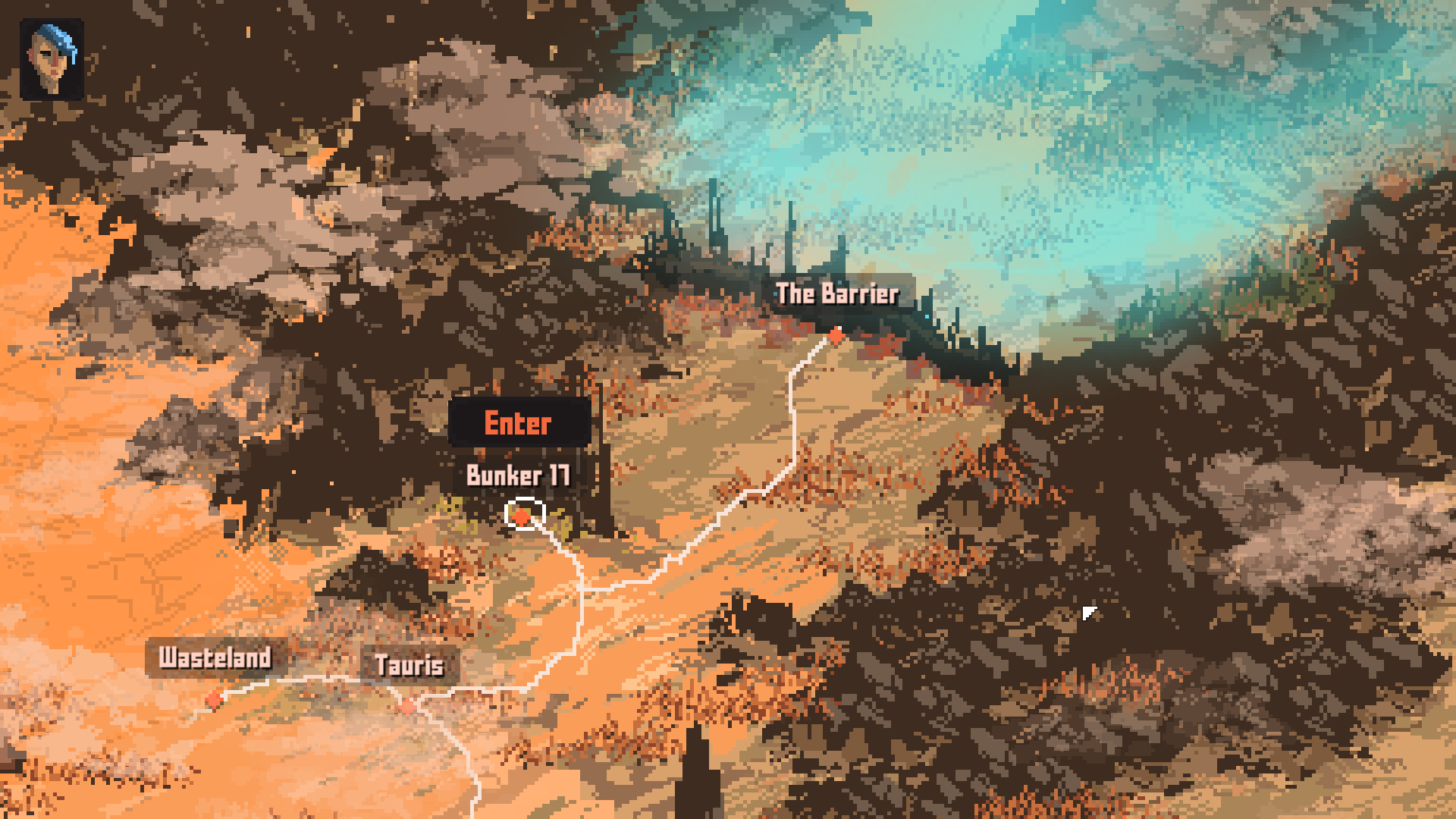
Repainting some elements on the world map.
Progress on the world map
joined 4,178 days ago

Post a comment
@artbohemian Hmmh. I am not sure now if you think the up or bottom is newer. The top one is. And I like about it that it has more organic feel to it. Also the contrast, although I overdo it a bit. The lower one was somehow more coherent though and those ground lines worked better. I think the optimum would be somewhere between those two.
wow...this is so cool! :) seems like you got a really good idea of how to use dark colors and shading to make shapes seem more 3 dimensional. is the one at the bottom more of what you intended?