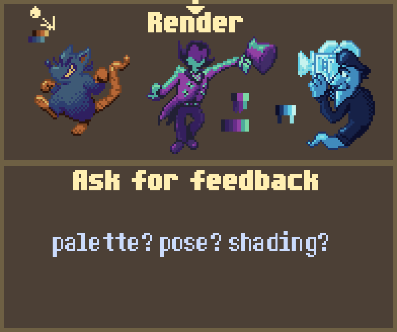
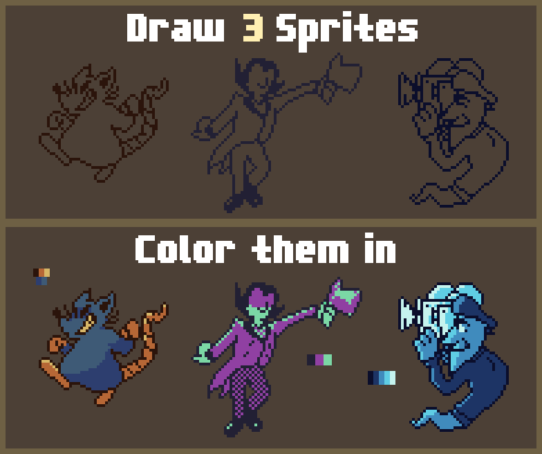
I tried to make things dynamic and interesting for each sprite and I would appreciate if anyone has some feedback on what could be improved or just what you liked about them. I would appreciate it! (ie. tighter pose/ palette adjustment / a pixel being off idk?)
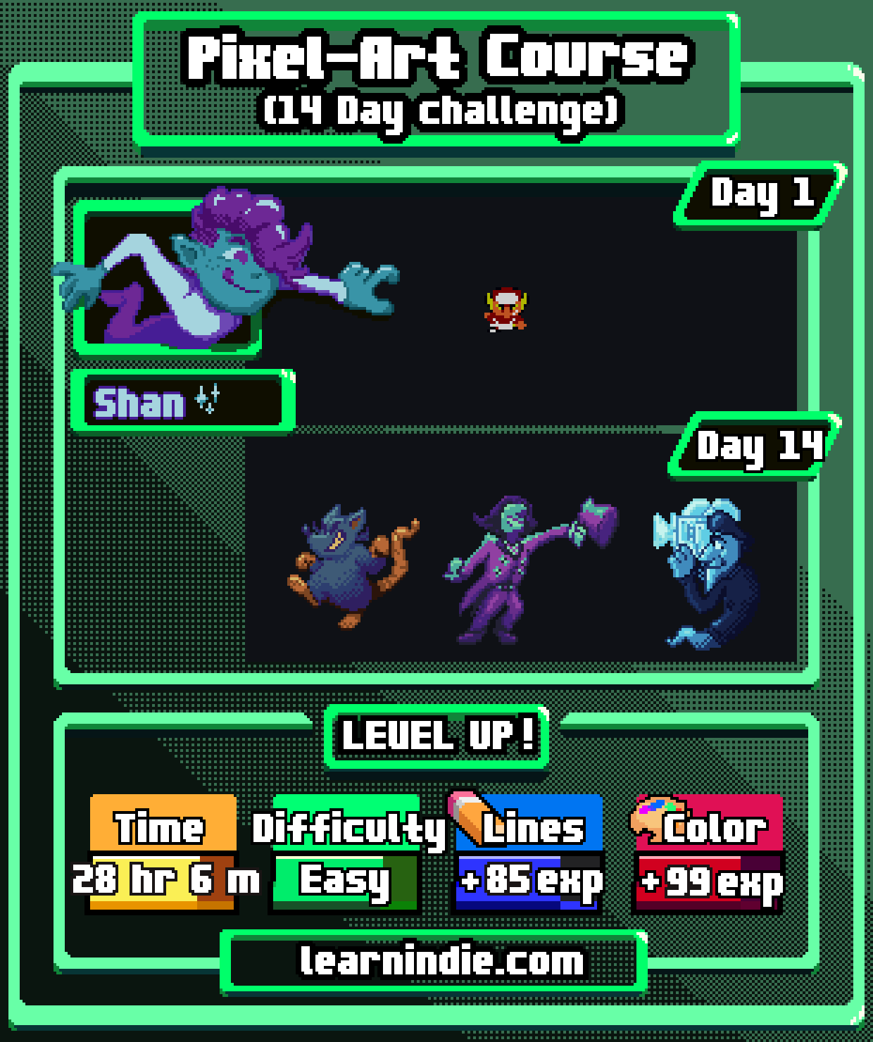
The sprites in order from left to right are 1. Just A Funky Little Rat 2. Ringmaster 3. Director Morty from LM3
Also great job from everyone so far it's been awesome taking this journey with you all!
Time spent: 1 hour 20 minutes ~
This was super exciting!! If you wanna check out my process peep the @spacecircus_ on twitch!!!


Time spent: 1 hour 50 minutes!
This was pretty tough ! I just simply had trouble with processing the materials but that was a personal issue!
I feel like I should try to stay loose with what I'm working with.. I was also going to initially going to just keep these as the sketch images but I tried to save some time using the outline tool and magic wand (+add to selection) so I could stay within the lines and quickly give it all some shading and light.
also sorry i made the sus man skinny af
It's good to see you guys again!
I had a busy day so my time has just clocked 30 minutes for working on this animation!
I was kinda indecisive on how I wanted this but I went super simple because I am not too confident in animating.
I have my process and progress being posted live on twitch at the @spacecircus_ !!!
Lets do our best together! Have fun everyone!
Time spent: +2 hours
This was the coolest thing to work on and it was extremely fun. I was so excited to make this little profile!! I completely understand why this took some extra time to put out there but I did my best to reflect everything I learned. . Plus I went for such a small sprite on the first day it looks a bit silly in comparison...
I'll be posting this on twitter soon on @rowlna_
Thank you so much Jason and Alex for spending all the time to plan and prepare the course and make the entire experience of learning everything feel so cool and exciting from start to finish. I can comment on how things could be different later because I need to rest a little bit.
You can do it everyone!! I believe in you guys!
Time spent: 3 hours 6 minutes
I was extremely nervous on getting the feedback but I tried my best to edit and polish the best to my ability. I'm glad there wasn't too much to change but I did what felt right to me and I hope this is good enough!
I'm glad we took this journey together and if you're still working on your part keep at it and don't give up!! You guys are doing a really good job too!
Thank you Alex, Jason and everyone trying out the course with me too!
I was trying to keep my progress on how I tried to draw these out but I shouldve done them by layer instead of like screenshots so I'll just describe it real quick.
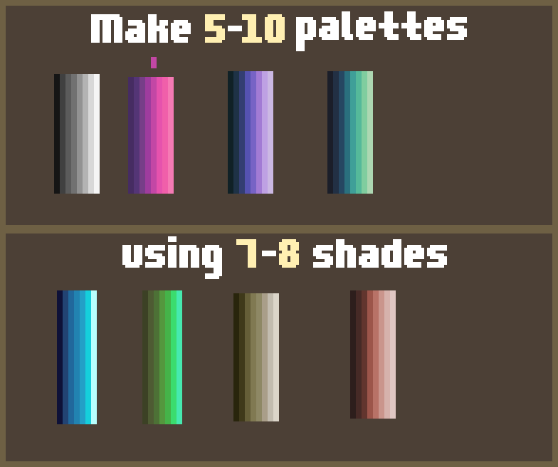
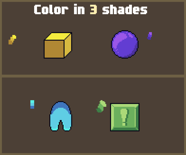
I started within aseprite and brought out the grid and just tried to sketch dynamic pose-ish kinda silhouettes with a light color and then outline it and try to clean it up the best I can. Then I tried the 3+5 color palettes to keep things a little challenging and also make a larger sprite in general.
I took a while on this but I just need to stop messing with it for now since we start touching up tomorrow and after
Time spent: +4 hours with breaks
Time spent: +2.5 hours
It was a busy day but I was really goofing off with this one haha...
I feel good about it, this was super hard to finish but these exercises have been extremely eye opening and helpful
Let's keep it up!!
Time Spent: 32 minutes
Some of these need to be more tight with changes in contrast but I like to see where I can improve
Palettes are still super fun!!
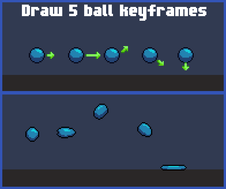
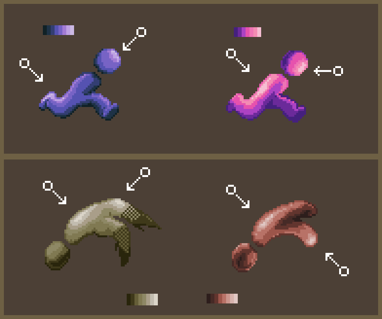
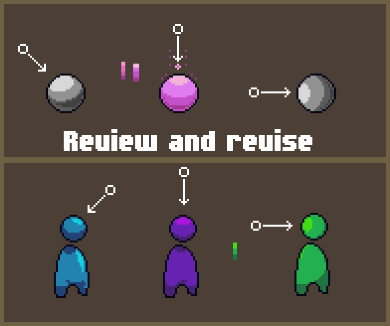
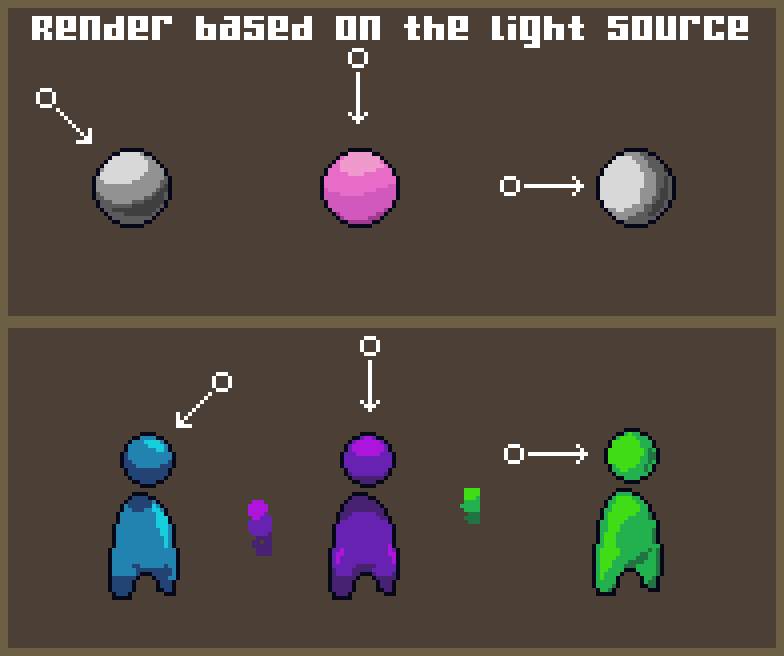
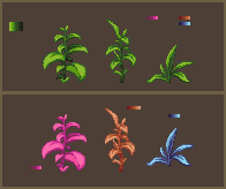
I did my best to adjust the four images, like with the balls, I made sure to get more even pixels as well as adjusting for the ratio of colors.
I also corrected the palette for the pink ball to have more contrast!!
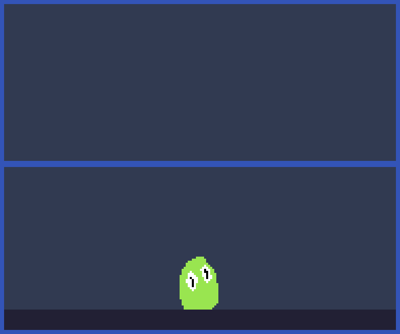
For the little fellas I corrected the shadows under the head of the first one and removed the highlights on the body. The second fella now has less highlight on the body(to be about the same distance as the other fellas) but still light enough to show the direction of light.
at least to the best of my ability
Time spent : 2 hours 16 minutes
Time spent : 40 minutes
I'm pretty nervous but I tried to not stress as much with today's entry...
I want to say one of the most challenging parts of this game is trying to feel where weight is for the sprite first and how to distribute the light and ratio the colors
Anyways I can't wait to see how we all did! It feels good to understand where I need to improve I've just felt a constant feeling of improvement whenever I tried to work throughout the week and with each lesson and uploading
Good luck to where ever you are in the week! I believe you guys keep going!
Time spent : +2 hours
By far the most difficult challenge I've faced so far
I was trying to just have fun and a little creative to help me push through it but this is just something I will have to keep practicing! I look forward to tomorrow
Time spent: 35 minutes
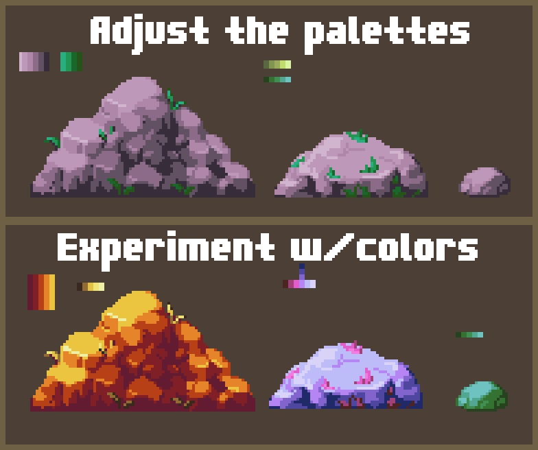
This was a cool exercise it felt nice to see how the colors came together and mixing things up can give some good ideas
If you are just starting you do NOT have to do what I did and make a ton you could do like
[[ie. (3 and 2) or like (5 and 5) as the minimum for the Three Palette and Five Palette respectively]<<
Time Spent : (For like the first 10 of both types) +1 hour 30 minutes
( The rest was an extra hour and a half just from experimenting and having fun)
Total time ?+3 hours?
You can tell when I got interested in SHIFTING HUES and started to experiment
But like Jason said Always start with the BASE color. if you get lost with where you're going, just use the Color Pick tool back on your BASE color then retry the SHADE/HIGHLIGHT you were going for
If you are having trouble thinking of just picking colors in general look around you what has a solid color? how is the light effecting it? what color is coming from the shadow?
and then when you get into SHIFTING HUES think about what is the color of your light? have you used those LED lights before and how they can change the entire color of the room and suddenly an object looks totally different
sometimes the sky will change in hue depending on the time of day, sunsets, sunrise, natural disasters, man made pollution and so on.
Once again I am not an expert on this I'm just applying what I know about environment and life experience I never knew how color stuff worked and
my colors might look funny but I had a blast doing this one and I learned a TOOONNN
tl;dr haha funny curve go brrr
I'm a little late with this and I had to take a break in the middle of it so I don't know my actual time so lets say
Time Spent + 1 hour 30 minutes
It was still a very helpful exercise and had me think actively about where i should place my pixels
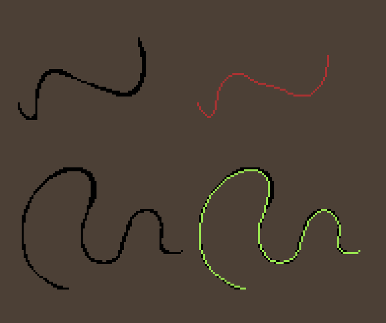
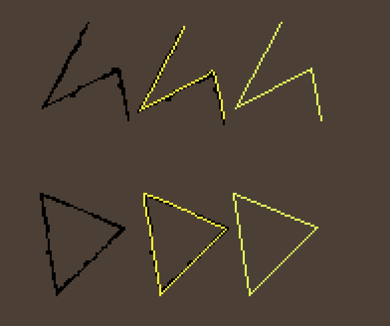
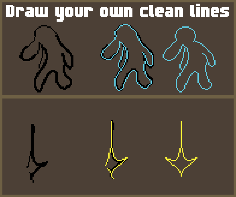
To break down what I did I tried to use the examples in Frames 4+5 to see if I could clean them and then compare what I did the first try looking a little sad but then I did the others and felt like I got the hang of it more (in the second image; I see where I made some mistakes - the muted yellow is the original correction)
The third image I kind of challenged myself to not only do clean up but also improve the image as well
I think it turned out great with how much time I used and I feel like I have a better grasp on how to do line art
Time spent: 51 minutes 47 seconds (note some of the time is off because clockify crashed on my desktop)
Time spent: 1 hour 48 minutes
I take a loooong time with things but I started my time from when opened aseprite and started brain storming and my mind kind of wanders and I was jumping between what would feel right trying to stick to a size but I went from the largest down to the smallest being 16x16 and used 5 colors (i was trying for 3 initially but i got frustrated LMAO)
I was going for something like a player character that was going to be holding something but they ended up doing a little strut with a kind of villainous feel
I sound really goofy for taking a while but trying to make something so small and convey a specific idea can be VERY tough!
If anyone is still in progress don't be shy about taking a little while on your work!
That being said I hope this doesn't look to weird because I didn't realize using the grid would make life a little bit easier (thats under the "View" tab >Grid > Grid Settings)
joined 1,649 days ago


Post a comment
Hi Shan, those are looking great. Regarding the pose you might want to look up the concept of line of action. The third one is the best in that regard. The second sprite would benefit most from the principle
https://www.animationresources.org/pics/pbanimation07-big.jpg